
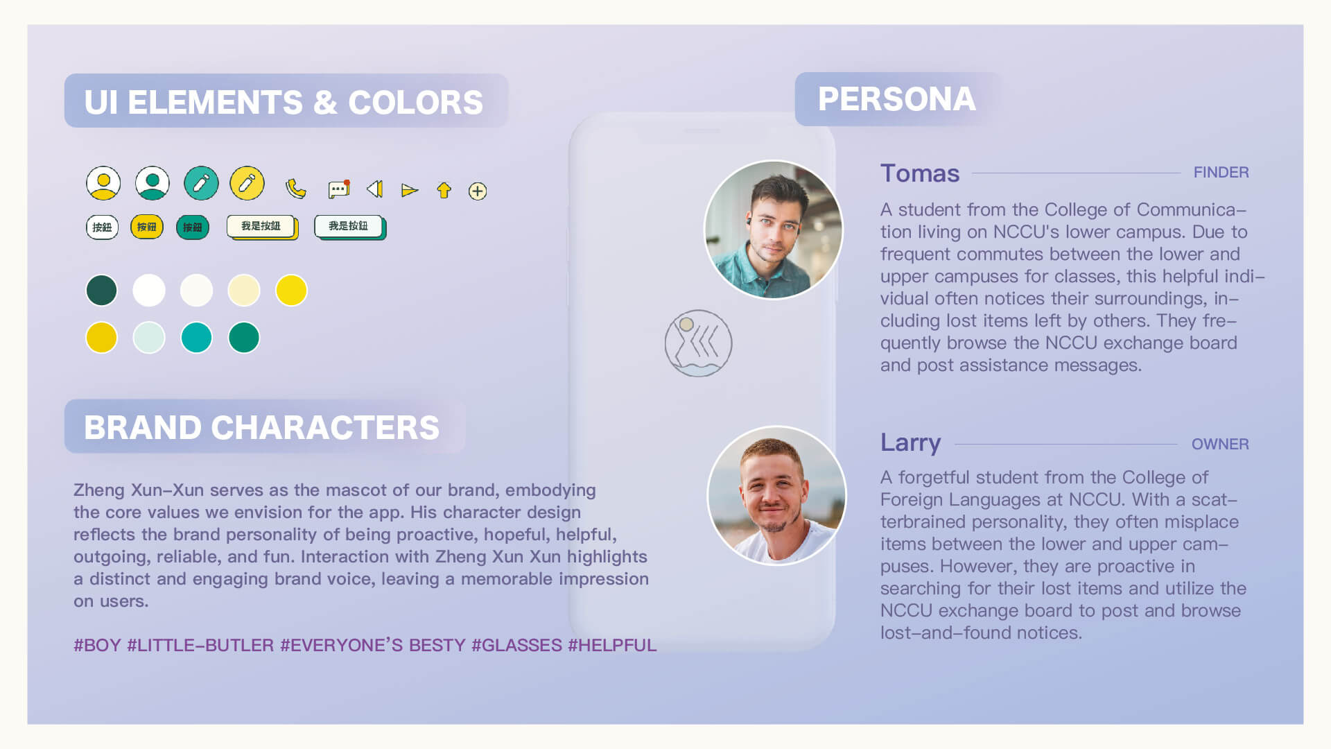
Visual identity components showcasing playful UI elements, vibrant color schemes, rounded shapes, and quick animations—designed to reflect an energetic and user-friendly tone. Structured layouts enhance clarity, while illustrated user personas guide design decisions tailored to student habits and real-life scenarios.

Interface overview showing both finder and owner workflows—featuring intuitive navigation, clear communication flows, privacy protection, and reward-based assistance. Pages include a simplified help submission form and a detailed item info layout, designed to reflect NCCU’s culture of mutual support.

User and UI flow diagrams outlining two core scenarios—"Looking for Lost Items" and "Returning Found Items"—with parallel step structures including browse, search, detail view, posting, messaging, and confirmation. Color-coded pathways (yellow for owners, green for finders) ensure clear role distinction and visual consistency.

[ CREDITS )
Co-ideation, quantitative user research, and qualitative user interviews - Cai-Ni Zou, Edwin Huang, and Selina Jiang. UX flow and interface design - Edwin Huang.
Zheng Xun-Xun
[ DESCRIPTION )
Mobile web platform for NCCU, designed to streamline lost-and-found coordination through intuitive user flows and visual identity.
[ CHALLENGE & DESIGN RATIONALE )
To improve the inefficient lost-and-found process at NCCU, we designed a mobile-first web platform based on thorough user research. By mapping the journey of both item owners and finders, we identified their pain points and created two streamlined, color-coded workflows that ensured clarity, privacy, and ease of use. The interface combined playful visuals with structured content, and usability testing helped refine the system for real-world adoption.


